
Responsive Design: How To Get It Right First Time
Disclosure: Your support helps keep the site running! We earn a referral fee for some of the services we recommend on this page. Learn more

In his 1939 memoir, Wind, Sand and Stars, French author and aristocrat Antoine de Saint-Exupery opined, “A designer knows he has achieved perfection not when there is nothing left to add, but when there is nothing left to take away.” The renowned aviator and Little Prince author did not live to see the Information Age, but his words nevertheless continue to resonate in a world where cyberspace has replaced the skies as the frontier of innovation.
In fact, with attention spans contracting even as the wealth of available content expands exponentially, Saint-Exupery’s “less is more” approach is more relevant than ever. Businesses no longer have the luxury of beating around the proverbial bush when the average window to engage a mobile visitor to their web site is less than five seconds. Considering more than five cents of every dollar is now spent online, it behooves you to make every one of those seconds count.
It’s about much more than simply finding a reputable hosting provider and uploading a basic website. You must create a site that responds to the needs of all visitors. (If you need help understanding how websites and web hosting work, please see our illustrated guide to hosting).
The key to catching a visitor’s eye and keeping that window wide open (and pointed at your page) lies in responsive design. The marketplace is quickly becoming a very significant part of a post-PC world, and as more users get their news, enjoy entertainment, and make purchases with tablets and smartphones, making sure your web site is designed to meet their ever-evolving needs is critical. It’s all about keeping the features visitors want, and none of the things they don’t.
There’s no room for clunky graphics, confusing navigation, or pages locked into desktop-only resolutions. Mobile users want their Internet lean, clean, and sized for their screen—so be sure to choose a host (and platform) that supports truly responsive design.
The potential rewards for making more out of less are substantial. With more than 2.1 billion mobile broadband subscribers as potential customers, economy of expression and maximum interactivity are paramount; the best design may just be the one boasting the greatest interactivity and the fewest “designer touches.”
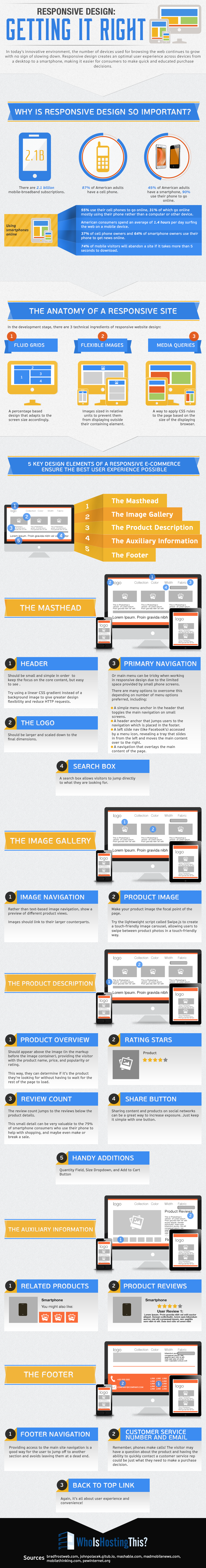
Responsive Design: Getting It Right
In today’s innovative environment, the number of devices used for browsing the web continues to grow with no sign of slowing down. Responsive design creates an optimal user experience across devices from a desktop to a smartphone, making it easier for consumers to make quick and educated purchase decisions.
Why Is Responsive Design So Important?
There are 2.1 billion mobile-broadband subscriptions.
87% of American adults have a cell phone.
55% use their cell phones to go online, 31% of which go online mostly using their phone rather than a computer or other device.
45% of American adults have a smartphone, 90% use their phone to go online.
American consumers spend an average of 1.4 hours per day surfing the web on a mobile device.
37% of cell phone owners and 64% of smartphone owners use their phone to get news online.
60% of tablet users prefer reading news on the mobile web than via an app.
79% of smartphone users use their phones to help with shopping.
71% of users expect mobile sites to load as fast if not faster than desktop sites.
74% of mobile visitors will abandon a site if it takes more than 5 seconds to download.
The Anatomy of a Responsive Site
In the development stage, there are 3 technical ingredients of responsive website design:
- Fluid Grids – A percentage based design that adapts to the screen size accordingly.
- Flexible Images – Images sized in relative units to prevent them from displaying outside their containing element.
- Media Queries – A way to apply CSS rules to the page based on the size of the displaying browser.
5 key design elements of a responsive e-commerce ensure the best user experience possible.
The Masthead
Header
Should be small and simple in order to keep the focus on the core content, but easy to see.
Try using a linear CSS gradient instead of a background image to give greater design flexibility and reduce HTTP requests.
The Logo
Should be larger and scaled down to the final dimensions.
Primary Navigation
Or main menu can be tricky when working in responsive design due to the limited space provided by small phone screens.
There are many options to overcome this depending on number of menu options preferred, including:
- A simple menu anchor in the header that toggles the main navigation on small screens.
- A header anchor that jumps users to the navigation which is placed in the footer.
- A left slide nav (like Facebook’s) accessed by a menu icon, revealing a tray that slides in from the left and moves the main content over to the right.
- A navigation that overlays the main content of the page.
Search Box
A search box allows visitors to jump directly to what they are looking for.
The Image Gallery
Image Navigation
Rather than text-based image navigation, show a preview of different product views.
Images should link to their larger counterparts.
Product Image
Make your product image the focal point of the page.
Try the lightweight script called Swipe.js to create a touch-friendly image carousel, allowing users to swipe between product photos in a touch-friendly way.
The Product Description
Product Overview
Should appear above the image (in the markup before the image container), providing the visitor with the product name, price, and popularity or rating.
This way, they can determine if it’s the product they’re looking for without having to wait for the rest of the page to load.
Review Count
The review count jumps to the reviews below the product details.
This small detail can be very valuable to the 79% of smartphone consumers who use their phone to help with shopping, and maybe even make or break a sale.
Quantity Field, Size Dropdown, and Add to Cart Button
Share Button
Sharing content and products on social networks can be a great way to increase exposure. Just keep it simple with one button.
The Footer
Footer Navigation
Providing access to the main site navigation is a good way for the user to jump off to another section and avoids leaving them at a dead end.
Customer Service Number and Email
Remember, phones make calls! The visitor may have a question about the product and having the ability to quickly contact a customer service rep could be just what they need to make a purchase decision.
Back to Top Link
Again, it’s all about user experience and convenience!
Sources
- Mobile Technology Fact Sheet – pewinternet.org
- Mobile Internet Usage and User Behavior Trends – madmobilenews.com
- MobiForge – mobithinking.com
- Why 2013 Is the Year of Responsive Web Design – mashable.com
- Anatomy of a Mobile-First Responsive Web Design – bradfrostweb.com
- How Fluid Grids Work in Responsive Web Design – 1stwebdesigner.com
- Beyond Media Queries: Anatomy of an Adaptive Web Design – slideshare.net
- What the Heck Is Responsive Web Design? – johnpolacek.github.io


Octa R
November 7, 2014
Very nice infographic! I believe it will be viral soon 😉
Mark Wingrove
November 26, 2015
It would be useful to have these figures for the UK market vs US. Yes, we all follow the US eventually in this area. I recall there was a turning point in the UK around February/ March time when OfCom (I think it was) stated that there were now more mobile devices in the uk than fixed devices accessing the internet. I also understand that Google will rank a responsive site above a fixed site for that reason as well.