
CSS From Top to Bottom – Including CSS3
Disclosure: Your support helps keep the site running! We earn a referral fee for some of the services we recommend on this page. Learn more
Cascading Style Sheets, or CSS, is the language that makes the web beautiful. Along with HTML and JavaScript, it is one of the technologies that every front end developer must master.
While the web is full of resources to help you learn CSS, if you’re a beginner you may have a hard time separating great resources from those that are just ok.
In this resource guide we provide a basic introduction to what CSS is, what it is capable of, as well as the features rolled out in the latest version: CSS3.

If you’re ready to jump in, here’s what this guide covers:
- Introduction to CSS: if you’re new to CSS, this is the place to start. This section provides a basic overview of CSS, and points you toward other great resources.
- What’s New in CSS3: if you want to research the modules that have been rolled out in CSS3, head for this topic where you’ll learn about media queries, box-sizing, 3D transformations, animations, multiple column layouts, and more.
- Creating Responsive Websites with CSS: websites today must render beautifully on a device of any size, and CSS is the language that makes it happen.
- How to Make Sliding Door Buttons: a primer on combining jQuery with CSS to create really cool effects.
- All About CSS Colors: get up and going with CSS colors. This section includes a great color reference.
- Writing Efficient CSS:: having fast loading pages is more important than ever. This will show you how to write CSS that can cut your load times down significantly.
- Master CSS Online: these resources provide a path to CSS mastery. If you prefer a learn-by-doing style of education, this section is for you.
- Amazing Works of CSS: looking for inspiration? Here we’ve collected some of the most amazing CSS creations on the web.
- The Official Word on CSS3: now that you know some CSS, and have learned which modules were rolled out in CSS3, it’s a good idea to familiarize yourself with the W3C, the organization that drives development of CSS.
- Recommended Reading: if you prefer to learn with the help of an ebook or paperback, check our list of recommended books, where you’re sure to find a title that piques your interest.

Introduction to CSS
CSS, or Cascading Style Sheets, is the language used to determine the style and appearance of a website.
The content of a website, including the headers, paragraphs, and images, are loaded according to instructions contained in an HTML document, and CSS tells your browser how to present each element in that HTML document.
CSS is used to do things like position items on a website, and to determine things like background color, border size and style, space between one item and the next, font family, and much more.
The core benefit of CSS is that creates a separation between the design of a website, and the contents of the website. By separating content from design sweeping design changes can be made to an entire website by adjusting just a few CSS rules in a single CSS file.
Three Places To Write CSS Rules
Before you can write a single line of CSS you need to know where to write it, and how to tie it to the HTML content that it is affecting. There are three different places you can write CSS:
- External style sheet: A document created solely to contain CSS rules which can be applied to multiple HTML documents using the LINK element in an HTML document header.
- Internal style sheet: CSS styles embedded directly into an HTML document header between style element tags.
- Inline styles: CSS styles added to a single HTML element using the style attribute within the HTML document.
While there is a time and place to use internal style sheets and inline styles, the vast majority of CSS styles are best applied using an external style sheet.
An external style sheet can be linked to any number of HTML documents enabling you to control the appearance of an entire website from a single CSS file.
Associating CSS Rules to Specific HTML Elements
CSS rules are constructed of two parts: a selector and a declaration. Each declaration also consists of two parts: a property and a value.
- Selectors identify, or select, the HTML element(s) that the CSS rule is to be applied to.
- Properties are names that describe the feature that the rule will address. A few commonly-used CSS properties are margin, border, background-color, text-align, and font-style.
- Values describe how a property should appear. If the property in question is margin, a common value might be 10 pixels.
Selectors and Specificity
Often times a style sheet will contain conflicting rules for a single HTML element. The concept of selector specificity will determine which rules are applied to each HTML element.
For example, if a list of links is being used for the main navigation, and additional lists are presented in the main body of a page, the navigation list and the lists in the body will need different sets of CSS rules.
Otherwise, the navigation menu and the list in the body of the page will be subject to the same CSS rules.
Understanding how CSS selectors work is the key to writing rules that affect the right HTML elements.
While the most common CSS selectors are the id, class, and tag or element selectors, other selectors such as attributes, positional selectors, pseudo selectors, and combinations of selectors can be used to create rules with greater specificity.
Common Uses of CSS
There are many CSS properties that are applied on virtually every page of HTML. Becoming familiar with these common CSS properties will allow you to tackle the majority of styling and positioning tasks.
Styling Font
CSS can be used to create any desired font style. Whether it’s color, size, weight, line height, alignment, case, the font type itself, or decorations such as underlines and strikethroughs that you want to control, CSS properties can be used to create the desired effect.
By applying the principles of specificity, a different font style can be applied to every HTML element on a page.
The Box Model
Space around each HTML element is best understood by thinking about what is referred to as the box model:
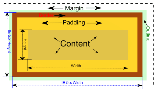
The box model consists of three CSS properties: padding, border, and margin. These properties can be applied to any HTML element. It’s easiest to understand these three properties by way of example.
Consider the following HTML paragraph element:
<p>A paragraph of text.</p>What would be the effect of writing the following CSS rule?
p {
    padding: 10px;
    border: solid 1px;
    margin: 10px;
   }
The paragraph would appear surrounded by:
- First, 10 pixels of padding (empty space) on all sides of the paragraph text,
- Second, a 1 pixel wide solid border around the paragraph and padding,
- Third, 10 pixels of margin (empty space) between the border and any adjacent element.
This is what is known as the box model. Each element is boxed first by empty space called padding, next by a border, and finally by empty space called margin.
Using Floats
Floats are used to send HTML elements to the left or right of their parent element without breaking them out of the overall flow of the HTML document. Along with their sister property clear, they are one of the best ways to create website layouts.
While we aren’t going to attempt to cover everything there is to know about floats, it’s critical to have a basic understanding of how they work as you begin learning CSS.
It’s easiest to understand floats in the context of a word processor document. Consider an image in a text document.
Typically each image will either be located all the way to the right, with text flowing by on the left hand side of the image, or all the way to the left, with text flowing by on the right hand side of the image. On the website, this look is accomplished by using the float property.
The float property has four acceptable values: left, right, none, and inherit. In the case of our example above:
- If the image is subject to a CSS rule with the property float, and the value of left, it will be positioned on the left side of the parent element, with text flowing by on the right hand side.
- The value right would perform just as you’d expect.
- None would prevent the element from floating either direction.
- Inherit would cause the element to inherit the float value applied to the parent element.
Floats are commonly used to create site navigation menus. Typically a site navigation menu consists of an HTML unordered list, with each list item floated to the left or right, resulting in list items that appear next to each other, rather than stacked up in a bulleted list style.
For example, a typical navigation menu might look like this in HTML:
<ul>
  <li><p>Home</p></li>
  <li><p>Our Store</p></li>
  <li><p>About Us</p></li>
  <li><p>Contact Us.</p></li>
</ul>
Without any CSS rules, this menu would appear as a bulleted list, with each item appearing on a new line. In order to make each item appear in a single horizontal line beginning from the left side of the page, the following CSS rule could be used.
li {
float: left;
}
Note that for the sake of simplifying this example we have used the list item tag li as the CSS selector. In reality, this would never be done. Typically a class would be assigned to the list itself, or to each list item, and that class would be used as the selector.
Clear the Float
Another property often used in conjunction with floats is the clear property. When one element is floated, all subsequent elements slide up and align themselves next to the floated element.
In cases where you want subsequent elements to start below the floated item, rather than next to it, you can use the clear property to force them to start on a new line.
We’ve just scratched the surface of what can be done with floats and the clear property, but we did find this great article from CSS-Tricks that provides an in-depth look into this topic.
Using the Position Property
The CSS position property is another method often used to create website layouts. Unlike the float property, the position property is often used to break elements out of the natural flow of an HTML document, and to dictate their position very specifically.
Two values can be used with the position property: relative and absolute. After applying one of those values, additional properties such as top, bottom, left, and right can be used to position the affected element very specifically.
Using the position property to create layouts is not without risks. Unlike the float property, elements positioned by the position property will overlap other items, creating the potential for more cross-browser and viewport size issues.
However, it is a widely used property within the CSS development world, and you would do well to learn the basics of using the position property.

What’s New in CSS3
While CSS2 was a single specification, CSS3 has been broken into more than fifty different modules, each at a different stage of development and acceptance.
Ongoing work on CSS3 is managed by the World Wide Web Consortium, or the W3C, and they offer a centralized location where you can keep track of all ongoing CSS3 standardization work.
While work on various CSS3 modules is ongoing, many modules already have broad acceptance, and are widely used by many websites. Here are ten of the most important CSS3 properties that have already gained broad acceptance, and are supported by all modern browsers.
- While the ability to create simple animations has been possible for a long time with JavaScript, CSS animations can now be created using simpler CSS syntax.
- The calculation function now available with CSS3 is extremely helpful for creating responsive layouts. It can be used to add, subtract, multiply, or divide, and the result of the calculation is then used as the property value.
- A variety of advanced selectors were added with CSS3, allowing an increased degree of specificity when selecting elements for CSS rules.
- The addition of gradients as a background type has empowered CSS developers to create impressive backgrounds that are downloaded and displayed quickly.
- Width and height properties applied to an element do not contain the padding, border, and margin. As a result, padding, margin, and border increase the size of an element beyond the specified width and height. This has long frustrated CSS developers who resort to complex math to fine-tune website layouts. However, with the new box-sizing property, the value border-box can be applied, forcing the padding, border, and margin within the constraints of the width and height specified, thereby simplifying the design of web page layouts.
- CSS can be used to apply borders to any HTML element, and with the border-image property, creating and using a custom border is easier than ever. The syntax of the property itself is pretty complex, but once you get the hang of it, you can quickly create one-of-a-kind borders for any element on a website.
- Media queries determine if the viewport of device being used to access a site meets certain specified characteristics. The @media CSS3 module is one of the key tools used to create responsive websites. Using media queries a CSS developer can create CSS rules that are only applied when certain media features, such as viewport width and height, and color display capabilities, are met. In this way, CSS developers can reposition and resize elements, or hide them all together, based on the results of the media query.
- Using multiple backgrounds to create a specific background effect is easier than ever with CSS3. By using the background property, multiple background images, colors, and gradients can be applied to any element.
- Using columns to create a newspaper-inspired layout is easier than ever with the columns property in CSS3. The property can be used to easily set the number of columns, and the width, creating a container where content flows easily from one column to the next. Columns are also useful for creating flexible navigation menus.
- 3D transformations are made possible by CSS3. This is a complex subject to master, and you’ll do well to start by reading about CSS transforms, and then working your way through a few tutorials.

Creating Responsive Websites with CSS
There are hundreds, if not thousands, of different device display sizes and resolutions used every day to access the web, and as a result, it is no longer enough to have a single full-size website, and one or two designs for smaller devices.
Today, your website needs to be viewable on large screens, small devices, and every viewport size in between.
In order to do this, your website CSS must comply with the three driving principles of responsive web design.
- First, the backbone, or grid, that defines your overall layout must be fluid.
- Second, images must resize automatically to render beautifully on any device.
- Third, media queries must be used to address the points where the original fluid design breaks down.
When approaching a new web design project, many experienced designers begin with a mobile first technique. A site designed with this technique begins with the simplest design intended for the smallest viewport, and additional styles are added as the viewport size grows.
The mobile first technique offers two noteworthy benefits:
- First, it forces the designer to identify the essential functions of the website, and to use those as the foundation for the design of the website. Quite often, a full-size website contains content, such as widgets, menus, and such, that aren’t part of the site when viewed on a mobile device. A mobile first approach helps to ensure that the core purpose and functionality of the site takes center stage across all viewport sizes.
- Second, website visitors accessing the site from a mobile phone download fewer CSS rules and website resources. If the full site is the first to load, a mobile user will download far more resources than are necessary. The mobile-first approach only loads the appropriate items on a mobile device, saving some of the visitor’s precious data, and creating a snappier site-loading experience.
Learning Responsive Design
One of the best ways to learn responsive design techniques is with a simple hands-on responsive design project. By creating your first responsive site design you’ll gain a better understanding of the concepts we’ve talked about.
With the growth in popularity of column style layouts, a new challenge has emerged for site designers: the challenge of adapting column layouts to devices of every size.
Thankfully, there resources to help CSS beginners and experienced developers alike learn how to work with this new CSS property in a responsive environment.
Another great way to begin to understand how the best CSS developers adapt sites is to look at a responsive website, in a range of sizes, side-by-side. Media Queries is one site where you can see hundreds of responsive website designs in a range of sizes all on one screen.

How to Make Sliding Door Buttons
Just using CSS, you can create great looking — and powerful — buttons. You can do even more with a little jQuery.
Below, we’ll show you how to take simple button images and set them up to use as toggleable buttons of all sizes across your website. In the end, you’ll produce reusable button code that you can use to generate buttons like these.
Click image to toggle animation.

Creating Your Images
The technique we’re going to use to create these buttons is called “sliding-door” CSS. To set up these buttons we need two images for each version of the button — in our case, two black button images and two blue button images, four images in total.
To create these images we start with solid button images.
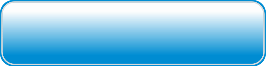
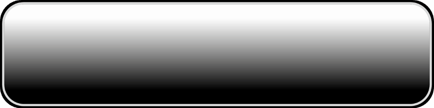
What we need to do is to split each button into two images:
- The left-hand image will be as narrow as possible while still capturing the full radius of the button corners.
- The right-hand image will be as wide as possible, as a matter of fact, we’ll want to use an image manipulation program to copy the body of the button a couple of times so that we can create really long buttons with the image.
Here are the images we’ll end up with after cutting them into the appropriate sizes:
Once you have all four images created, you’re ready to start coding.
Button HTML
Our button HTML will consist of three components: an outer div wrapper, an anchor element, and a span element.
<div class="sliding-button">
  <a href="" class="sliding-link">
    <span class="sliding-text">
      Button Text
    </span>
  </a>
</div>
In the code block above, all three elements are broken out into separate lines so that you can more easily see what’s going on.
However, in practice, you’ll probably want to keep them all inline, especially if you’re using a content management system (CMS) such as WordPress that will insert paragraph tags after each line break.
Adding Button Images
Right now, if you render the bit of HTML from the example above, all you’ll get is a link that says “Button Text.” The next step we’ll want to take is to add the button image to our code.
However, before we do that, let’s add a bit of styling to the outer div wrapper so that we can see what’s going on a little more clearly.
.sliding-button {
  display: inline-block;
  width: auto;
  margin: 20px;
}
That bit of code will simply add some space around our button, and force the containing div to shrink down to the size of the link and text. Now we’re ready to add our button images.
.sliding-link {
  background-image: url('https://cybernewsguide.com/files/resources/blue-button-right.png');
  background-size: auto 100%;
  background-position: right;
  background-repeat: no-repeat;
}
.sliding-text {
  background-image: url('https://cybernewsguide.com/files/resources/blue-button-left.png');
  background-size: auto 100%;
  background-position: left;
  background-repeat: no-repeat;
}
So now we’ve added our button image. Unfortunately, it’s not much to look at quite yet. Also, if you zoom in and look closely, you’ll notice that the left-hand image is actually just sitting on top of the right-hand image. Not the effect we’re going for.

Button Styling
Let’s add a bit of padding around the text. This will get our button looking more like a button. In addition, we’ll need to change the display of the span and anchor elements to inline-block to get both of them to respond to padding and margin the way we want them to.
.sliding-link {
  display: inline-block;
}
.sliding-text {
  padding: 20px;
  display: inline-block;
}
That code will give our button some size. However, we still have the troublesome overlap issue between the left and right images. What we need to do is use margin to move the right-hand image a little to the right, and then apply the exact same negative margin to the left-hand image.
.sliding-link {
  margin-left: 17px;
}
.sliding-text {
  margin-left: -17px;
}
The 17-pixel value is applicable to our specific button images. If you’re using different images, you will need to fine-tune this value by trial-and-error until the button looks right.
Before moving on, let’s also go ahead and add some styling to our button text.
.sliding-text {
  color: #fff;
  font-size: 14pt;
  font-family: 'Open-Sans', Arial, sans-serif;
  text-transform: uppercase;
  font-weight: bold;
  text-align: center;
}
At this point, our button actually looks like a button!

Button Hover Effect
Right now, if you hover your mouse over the button, there’s no visual indication that your mouse is over the button. Let’s fix that by adding a hover effect.
.sliding-text:hover, .sliding-text:active {
  box-shadow: inset 0 0 0 1000px rgba(255,255,255,.2);
}
While that certainly works, it’s a bit rough. First, the hover effect transitions in and out too harshly. Second, if you place the button on a dark background you’ll notice that the hover effect extends beyond the rounded corners of the button.
We can fix both of those issues with a few lines of code added to the span element.
.sliding-text {
  -webkit-transition-property: box-shadow; /* Safari */
  -webkit-transition-duration: .2s; /* Safari */
  transition-property: box-shadow;
  transition-duration: .2s;
  border-radius: 12px;
}
Now our hover effect will transition in and out over the course of two-hundredths of a second — a small easing, but enough to make the transition feel smooth. Second, the border-radius rule will round off the corners of the hover effect to fit the image.
Note that the 12-pixel value we applied to the border-radius is specific to our button image. If you’re using a different image, you’ll need to fine-tune this value.
Switching Button Images
Right now, we can add a URL to the anchor element href attribute, and our buttons will work great as links. However, at the top of this post, there was a gif that demonstrated a toggle effect that changed the button image. Let’s walk through the process of creating toggle buttons now.
First, we’ll need to add the new image to the buttons. The way we’ll do that is by adding the button images to a new class, and then using jQuery to toggle the class on and off the button when the button is clicked.
Let’s start with the CSS.
.current-button .sliding-link {
  background-image: url('https://cybernewsguide.com/files/resources/black-button-right.png');
}
.current-button .sliding-text {
  background-image: url('https://cybernewsguide.com/files/resources/black-button-left.png');
}
Right now, the toggle effect doesn’t work. However, if you manually add the class current-button to the button container div, you’ll see the second version of your button.
In order to switch between the two versions of the button on click, you’ll need to use jQuery to toggle the current-button class on and off for the button.
However, before we do that, we’ll need to decide which buttons we want to be toggle buttons. We can do this by adding a class to any buttons that we wish to use as toggle buttons. Let’s use the class toggle-button for this purpose.
So, to designate any button as a toggle button, we’d just add that class to the outer div wrapper:
<div class="sliding-button toggle-button">
  <!--button anchor and span-->
</div>
Now, we can use jQuery to toggle the current-button class on and off for that button.
<script src="https://ajax.googleapis.com/ajax/libs/jquery/3.1.1/jquery.min.js"></script>
<script>
$('.toggle-button').click(function() {
  $( this ).toggleClass('current-button');
  return false;
});
</script>
There are a few things going on in that code. Let’s walk through it.
First, we load jQuery from Google Hosted Libraries. If your website already uses jQuery, then you can omit the first script element.
The second script element contains a simple jQuery function.
The function watches any element with the class toggle-button. When any element with that class is clicked, a function is fired toggling the class current-button on or off for the clicked element.
Finally, the function returns the value false which prevents the default link behavior, which is to reload the page since our anchor element href attribute will be empty on a toggle button.
With those bits of code added, we can toggle our button to our heart’s content.
Click image to toggle animation.

The Full Source Code
If you’ve been following along, step-by-step, then you’ll already have created a full version of the source code for these buttons. However, if you haven’t been following along, you can grab the full source code for the button in this tutorial by copying the code below into an HTML document.
<!DOCTYPE html>
<html>
  <head>
    <title>Sliding Door Buttons</title>
    <style>
      .sliding-button {
        display: inline-block;
        width: auto;
        margin: 20px;
      }
      .sliding-link {
        background-image: url('https://cybernewsguide.com/files/resources/blue-button-right.png');
        background-size: auto 100%;
        background-position: right;
        background-repeat: no-repeat;
        display: inline-block;
        margin-left: 17px;
      }
      .sliding-text {
        background-image: url('https://cybernewsguide.com/files/resources/blue-button-left.png');
        background-size: auto 100%;
        background-position: left;
        background-repeat: no-repeat;
        display: inline-block;
        padding: 20px;
        margin-left: -17px;
        color: #fff;
        font-size: 14pt;
        font-family: 'Open-Sans', Arial, sans-serif;
        text-transform: uppercase;
        font-weight: bold;
        text-align: center;
        -webkit-transition-property: box-shadow; /* Safari */
        -webkit-transition-duration: .2s; /* Safari */
        transition-property: box-shadow;
        transition-duration: .2s;
        border-radius: 12px;
      }
      .sliding-text:hover, .sliding-text:active {
        box-shadow: inset 0 0 0 1000px rgba(255,255,255,.2);
      }
      .current-button .sliding-link {
        background-image: url('https://cybernewsguide.com/files/resources/black-button-right.png');
      }
      .current-button .sliding-text {
        background-image: url('https://cybernewsguide.com/files/resources/black-button-left.png');
      }
    </style>
  </head>
  <body>
    <!--toggle button-->
    <div class="sliding-button toggle-button"><a href="" class="sliding-link"><span class="sliding-text">Toggle Button</span></a></div>
    <!--link button-->
    <div class="sliding-button"><a href="http://example.com" target="_blank" rel="noopener" class="sliding-link"><span class="sliding-text">Link Button</span></a></div>
    <script src="https://ajax.googleapis.com/ajax/libs/jquery/3.1.1/jquery.min.js"></script>
    <script>
      $('.toggle-button').click(function() {
        $( this ).toggleClass('current-button');
        return false;
      });
    </script>
  </body>
</html>
Putting Your Button to Good Use
The last piece of the puzzle is to put your new buttons to good use. Here are a few ideas to get you started:
- Add a URL to the anchor element
hrefattribute and use the button to link to any webpage. Note that to do this you’ll want to omit thetoggle-buttonclass from the buttondivwrapper. - Use additional jQuery or JavaScript to display or hide additional information when the button is toggled.
- If you’re really feeling ambitious, use the buttons for site navigation, and use jQuery to determine if the current page matches the button URL and toggle the
current-buttonclass if the two match.

All About CSS Colors
One of the most important — and potentially confusing — things that can be specified with CSS is color. Nearly all elements on a web page can be colored using CSS.
The CSS Color Properties
One detail that frequently trips up new front-end developers is the CSS color property. What makes it confusing is that color doesn’t control the element itself, but the text inside the element.
The color of an element itself (the box) will usually be controlled by background-color, border-color, or the shorthand background and border properties, which include color information. You can also set color on a box-shadow.
Typically, the background-color of an element covers the element’s content, padding, and border area. This is the usual behavior imagined by the creators of the CSS standard. However, there are ways of making the padding and the content different colors.
Color Declarations
Aside from the different CSS properties that can be used to specify a color, there are three different ways to identify a color in CSS: RGB, hex value, or name.
/* All three of these will be the same color. */
.red-rgb {
 background-color: rgb(255, 0, 0);
}
.red-hex {
 background-color: #ff0000;
}
.red-name {
 background-color: red;
}
The second one (hex value) is the most common, but we’ll start with RGB because hex values don’t make sense unless you understand how RGB works.
RGB Values
Computer monitors, television screens, and other similar displays, have pixels. On color displays, each pixel is divided into three sub-pixels: red, green, and blue.
These are the so-called “primary colors of light.” A combination of these three colors at varying intensities can be used to create any color the human eye is capable of seeing. This is known as “additive color mixing.”
(It is worth knowing that this has everything to do with the human eye, and not with light itself.)
Different display screens have different capabilities in terms of the range of intensities that each sub-pixels can produce. A very simple display might only have two intensities for each color (off or on), whereas a very high-quality display might have many more gradations.
As a standard, computers use a range from zero (0 — all the way off) to 255 (all the way on) for each sub-pixel (for example, 128 is half-way on). This is 256 possible intensities for each sub-pixel, which means that each sub-pixel’s value can be stored as an 8-bit byte ( 2 8 = 256 ).
Since there are three colors, each represented with 8 bits, the total number of colors that can be represented this way is over 16 million ( 256 3 = 16,777,216 ).
This range of colors can be represented by simply noting the value of each sub-pixel, like this:
rgb(0, 128, 255)In that example, the red sub-pixel is all the way off, the green sub-pixel is half-way on, and the blue sub-pixel is all the way on. That color looks like this:
In this system, white (all colors all the way on) is rgb(255, 255, 255) and black (all colors off) is rgb(0, 0, 0).
RGB colors can also be specified as percentages, using a decimal not with a single trailing digit:
rgb(0.0, 50.0, 100.0)This use is not very common.
Hex values
A more compact way of writing the same exact information is to use hex values. A hex color value is written with a hash (pound) sign, followed by six hexadecimal characters, in three pairs, like this:
#0080ffThe first pair represents the red value, the second pair represents the green value, and the third pair represents the blue value. In this example, 00 means no red at all, 80 means green half-way on, and ff means blue all the way one. So this is the same color as rgb(0, 128, 255).
This might seem a little confusing if you’re not use to hexadecimal numbers. In our normal decimal system, each digit can have 10 values (0-9). In hexadecimal numbering, each digit has 16 possible values (0-9, a-f).
This makes it possible to represent all the values from 0-255 in two digits, 0-ff. See this hexadecimal tutorial for more information.
In this system, white is #ffffff and black is #000000.
Hex color values are the most common way to specify colors in CSS.
CSS Color Names
The final way to specify a particular color is to use one of the pre-defined color names. The W3C maintains, and occasionally updates, a list of official color names which can be used in place of the numbered color codes. For example, black can be used instead of #000000.
In the early days of the web, these named colors helped define a small, unofficial set of ” web safe colors ” which were well-supported across the majority of browsers and display screens.
Today, the biggest advantage of having color names is that they are easier to remember. For example, lightblue is easier to remember (and type correctly) than its equivalents, #add8e6 or rgb(173, 216, 230).
CSS Color Names List
| Color Name | Hex values | Color Example |
|---|---|---|
aliceblue | #f0f8ff | |
antiquewhite | #faebd7 | |
aqua | #00ffff | |
aquamarine | #7fffd4 | |
azure | #f0ffff | |
beige | #f5f5dc | |
bisque | #ffe4c4 | |
black | #000000 | |
blanchedalmond | #ffe4c4 | |
blue | #0000ff | |
blueviolet | #8a2be2 | |
brown | #a52a2a | |
burlywood | #deb887 | |
cadetblue | #5f9ea0 | |
chartreuse | #7fff00 | |
chocolate | #d2691e | |
coral | #ff7f50 | |
cornflowerblue | #6495ed | |
cornsilk | #fff8dc | |
crimson | #dc143c | |
darkblue | #00008b | |
darkcyan | #008b8b | |
darkgoldenrod | #b8860b | |
darkgray | #a9a9a9 | |
darkgreen | #006400 | |
darkgrey | #a9a9a9 | |
darkkhaki | #bdb76b | |
darkmagenta | #8b008b | |
darkolivegreen | #556b2f | |
darkorange | #ff8c00 | |
darkorchid | #9932cc | |
darkred | #8b0000 | |
darksalmon | #e9967a | |
darkseagreen | #8fbc8f | |
darkslateblue | #483d8b | |
darkslategray | #2f4f4f | |
darkslategrey | #2f4f4f | |
darkturquoise | #00ced1 | |
darkviolet | #9400d3 | |
deeppink | #ff1493 | |
deepskyblue | #00bfff | |
dimgray | #696969 | |
dimgrey | #696969 | |
dodgerblue | #1e90ff | |
firebrick | #b22222 | |
floralwhite | #fffaf0 | |
forestgreen | #228b22 | |
fuchsia | #ff00ff | |
gainsboro | #dcdcdc | |
ghostwhite | #f8f8ff | |
gold | #ffd700 | |
goldenrod | #daa520 | |
gray | #808080 | |
green | #008000 | |
greenyellow | #adff2f | |
grey | #808080 | |
honeydew | #f0fff0 | |
hotpink | #ff69b4 | |
indianred | #cd5c5c | |
indigo | #4b0082 | |
ivory | #fffff0 | |
khaki | #f0e68c | |
lavender | #e6e6fa | |
lavenderblush | #fff0f5 | |
lawngreen | #7cfc00 | |
lemonchiffon | #fffacd | |
lightblue | #add8e6 | |
lightcoral | #f08080 | |
lightcyan | #e0ffff | |
lightgoldenrodyellow | #fafad2 | |
lightgray | #d3d3d3 | |
lightgreen | #90ee90 | |
lightgrey | #d3d3d3 | |
lightpink | #ffb6c1 | |
lightsalmon | #ffa07a | |
lightseagreen | #20b2aa | |
lightskyblue | #87cefa | |
lightslategray | #778899 | |
lightslategrey | #778899 | |
lightsteelblue | #b0c4de | |
lightyellow | #ffffe0 | |
lime | #00ff00 | |
limegreen | #32cd32 | |
linen | #faf0e6 | |
maroon | #800000 | |
mediumaquamarine | #66cdaa | |
mediumblue | #0000cd | |
mediumorchid | #ba55d3 | |
mediumpurple | #9370db | |
mediumseagreen | #3cb371 | |
mediumslateblue | #7b68ee | |
mediumspringgreen | #00fa9a | |
mediumturquoise | #48d1cc | |
mediumvioletred | #c71585 | |
midnightblue | #191970 | |
mintcream | #f5fffa | |
mistyrose | #ffe4e1 | |
moccasin | #ffe4b5 | |
navajowhite | #ffdead | |
navy | #000080 | |
oldlace | #fdf5e6 | |
olive | #808000 | |
olivedrab | #6b8e23 | |
orange | #ffa500 | |
orangered | #ff4500 | |
orchid | #da70d6 | |
palegoldenrod | #eee8aa | |
palegreen | #98fb98 | |
paleturquoise | #afeeee | |
palevioletred | #db7093 | |
papayawhip | #ffefd5 | |
peachpuff | #ffdab9 | |
peru | #cd853f | |
pink | #ffc0cb | |
plum | #dda0dd | |
powderblue | #b0e0e6 | |
purple | #800080 | |
rebeccapurple | #663399 | |
red | #ff0000 | |
rosybrown | #bc8f8f | |
royalblue | #4169e1 | |
saddlebrown | #8b4513 | |
salmon | #fa8072 | |
sandybrown | #f4a460 | |
seagreen | #2e8b57 | |
seashell | #fff5ee | |
sienna | #a0522d | |
silver | #c0c0c0 | |
skyblue | #87ceeb | |
slateblue | #6a5acd | |
slategray | #708090 | |
slategrey | #708090 | |
snow | #fffafa | |
springgreen | #00ff7f | |
steelblue | #4682b4 | |
tan | #d2b48c | |
teal | #008080 | |
thistle | #d8bfd8 | |
tomato | #ff6347 | |
turquoise | #40e0d0 | |
violet | #ee82ee | |
wheat | #f5deb3 | |
white | #ffffff | |
whitesmoke | #f5f5f5 | |
yellow | #ffff00 | |
yellowgreen | #9acd32 |
Other CSS Color Resources
- CSS Color Tutorial from W3Schools is a quick overview of the topic, with additional examples.
- CSS Color Converter is an online tool that takes any color format and converts it to all the others, plus provides possible color palette choices.
- CSS Color Reference from Mozilla Developer Network is one of the best places to get information about the various color standards and specifications.
- Colors, Backgrounds, and Gradients: Adding Individuality with CSS (2015), by Eric A Meyer, is a great book that covers CSS colors in detail.

Writing Efficient CSS
Writing efficient CSS is incredibly important. Today’s internet users have very short attention spans, so the longer your site takes to load, the higher the chances they’ll hit the back button.
If you’re building a simple website, efficient CSS doesn’t matter that much. But such websites are more and more rare. If you’re building a large and complex site, you should be concerned with the efficiency of your CSS.
Below we highlight why efficient CSS is important, how to write more efficient selectors, and offer some tools that can help you further optimize your code.
Why Efficient CSS Matters
Not taking CSS efficiency into account when writing your code can seriously harm the overall performance of your page. And the last thing you want is to have a slow loading website.
Your goal is to make it as easy as possible for the browser to render your code — even browsers that run less efficiently.
There have been arguments made that’s it’s not the job of the author to worry about optimizing selectors, it should be the job of the engine that’s compiling the code. Although this is true to a certain extent, not every user is going to be using a modern browser.
There are still users all over the world who only have access to older computers and browsers. You’d hate to penalize those users, just because they don’t have access to the latest technology. Maybe in time, this will change.
But, having your users in mind when you’re writing code is always a good idea.
Selectors Are The Most Important
One of the most important aspects of writing efficient CSS is understanding how browsers read and compile it. The big thing to understand is that they read from right to left.
It begins with the key selector and moves to the left to look for the ancestors in the rule’s selector. Then, it continues to move left until the rule is completed, or it results in a mismatch.
So, if your code reads ul > li a img, then the first thing that’ll be interpreted is a img.
The key selector is the last part that we’ve assigned to the end of the selector.
Four Types of CSS Selectors
There are four main types of CSS selectors that you need to be aware of and use the right way for your CSS code to be efficient. The selectors below are ordered in terms of their efficiency. Those at the top are the most efficient, and the bottom the least.
ID Selector
The ID selector refers to a specific HTML element using the ID attribute, and looks like the following:
#main-navigation In the HTML, this would be used as follows:
<div id="main-navigation">
...
</div>
Class Selector
The class selector will select elements within a specific class attribution, and looks like the following:
.center In the HTML, this would be used as follows:
<p class="center">
...
</p>
Tag Selector
Tag selectors are less efficient than IDs and classes, so they should be used sparingly. But they can still be effective in the right circumstances. Tag selectors generally look like this:
ul In the HTML, the tag will simply be styled as dictated by the CSS whenever the tag is used (ul in this case).
Universal Selector
The universal selector can be applied to any element within your document. To write efficient CSS you should avoid using the universal selector whenever possible. The universal selector is designated by the following:
* Efficient CSS Rules To Keep In Mind
There are a few key rules to keep in mind that will help you write more efficient CSS. By taking these rules to heart your CSS code will load much faster and perform better across every web browser around.
Do Not Use Descendant Selectors
A descendant selector is any two selectors that aren’t separated by a combinator. The descendant selector is the least efficient selector, and can really have a negative impact on performance.
Some example of descendant selectors you shouldn’t be using, include:
header h3
footer p
.body div
Don’t Tag-Qualify IDs
Since IDs can refer to only a single element, it makes no sense to qualify them with the specific tag they will be used with. For example,
li#left-navigation It isn’t necessary to tell the browser what tag the selector will be applied to. Instead, this is more efficient:
#left-navigation Note that the same thing is true of classes, but to a lesser extent. So don’t qualify classes either.
Use CSS Inheritance as Much as Possible
Property inheritance is an important thing to master. Learn which properties will get passed down from element to element, and let them do their job.
For example, font-size is inherited. So if you set it for the body of the document, it isn’t necessary to set it for the p and li tags.
Limit Your Rules
Adding too many rules to your tags will slow down your CSS code, and greatly complicate the matching process.
For example
body .widget-left #widget
This is poor code. There is just too much going on. On the other hand:
#widget
.widget-left
These are much more efficient.
Implementing the above tips will help to make your CSS code much more efficient. If you’re looking to test your code or find even more ways to make it efficient, then check out some of the tools highlighted below.
Tools to Improve Your CSS
If you keep the above rules in mind your CSS code will be much more efficient.
But, if you’re looking to optimize your CSS code even further, there are tools that will help you get there. Below we profile a few tools that will help to compress your CSS, define selectors, and even create your IDs for you.
- CSS Stress Testing: this is cool in that it makes micro-adjustments to your site, like scrolling, zooming, resizing, and more. Plus, it does all of this in under 30 seconds. It then sends you a report about the effectiveness of your CSS.
- Define CSS IDs: the web pack CSS loader is a very useful tool. It can help to specify classes and IDs, and can even do some CSS optimization for you.
- Reduce Your CSS Selectors: this shows all of the CSS selectors currently in place along with which elements selectors are using. This allows you to reduce the number of selectors you’re using, so you can reduce your overall memory load. With this tool you can plug in any URL, so you can also study other sites.
- Shrink Your CSS Code: shrink your existing CSS code. The less code you have to compile the better. It provides a “before” and “after” screenshot, so you can see the changes this tool made.
- Compress Your CSS Files: gzipping your CSS files will help to clean it up. Thus, it can help to reduce the overall size of the HTTP response and thus the server response time.
Writing Efficient CSS Is a Good Idea
Whether or not you choose to optimize your CSS is up to you. It’s not completely necessary with today’s modern browsers. However, if you are creating a complicated site, it is well worth doing.
What’s more, you still may have users who have older setups and it’s a smart idea to cater to their needs too. Hopefully, this section will help you do just that and write more efficient CSS.

Master CSS Online
There are many places online where you can watch videos, complete tutorials, and even code within a browser as you learn CSS. While there are dozens, if not hundreds, of resources available, here are a few of our favorite free places to learn about CSS.
If you really are brand new to CSS, Don’t Fear the Internet is a beginner-friendly video series that introduces both CSS and HTML. If you’re starting from scratch, this is a well-produced series that won’t intimidate those who are just embarking on their journey to learn CSS.
If you’ve never written a style sheet before, a good place to write your first is the CSS Tutorial provided by the World Wide Web Consortium (W3C). This tutorial doesn’t provide a lot of explanation, so if you’re a hands-on learner, this might be an ideal place to start.
Writing HTML and CSS requires that you use a text editor, save files with the proper formatting and headers, and use a browser to view your work. If you’d rather go through a program that lets you edit files directly in your browser, Codecademy is exactly what you’re looking for.
Another resource that covers much of the same ground as Codecademy, but one that will require that you learn how to use a text editor and how to save files in the correct format, is Learn to Code HTML and CSS by Shay Howe. Once you’ve mastered the basics, an advanced program is also available.
Controlling page layouts is one of the trickiest and most important tasks accomplished with CSS. If you’re having trouble getting the hang of controlling layouts, the tutorial from Learn Layout is just what you need.
The Mozilla Developer Network offers a CSS tutorial that covers all of the basic functions of CSS in a way that will prepare you to move on to more challenging topics.
If you want a solid foundation from which you can grow into a full-fledged CSS developer, you could do much worse than the MDN CSS tutorial.
Lastly, no list of resources would be complete without mentioning the organization that drives development of CSS.
While certainly not the easiest tutorial in this list, it is comprehensive and detailed. If your goal is to learn a little CSS, this is not the tutorial for you, but if you are embarking on the journey to become a full-fledged CSS developer, this is a good tutorial to get under your belt.

Amazing Works of CSS
If you’re looking for design inspiration, or want to get a better sense of what CSS can do, here are a few places to check out showcased works of CSS.
- Creative Bloq has pulled together this curated list of twenty two impressive CSS animations. As you look through them, keep in mind that many of these animations do also make use of JavaScript in addition to CSS.
- CSS Design Awards created this list of ten animations complete with demos and tutorials so that you can apply the concepts to your own projects.
- The MDN DemoStudio is a place where you can view hundreds of CSS demos sorted either by popularity, number of views, trending status, or by viewing the newest demos first.
- Many of the animations selected for the previous lists are hosted at Code Pen, and heading directly to the pens will give you access to a huge number of impressive animations built using HTML, CSS, and JavaScript.
- If you’ve seen all the fancy animations you care to see, and instead want to see how CSS can be used to completely change an entire website without making a single change to the HTML, check out these elegant website designs that emphasize the power of CSS.

The Official Word on CSS3
The W3C is the organization that drives development of web standards, including the CSS3 modules. As you learn CSS and level-up your skillset, you should familiarize yourself with the W3C, and the technical documentation they offer.
The W3C CSS homepage is the launching pad for all things CSS at the W3C. From this page you can locate information about ongoing standard development work.

Recommended Reading
One of the most effective ways to develop a deeper understanding and expertise with CSS3 is to use multiple sources and methods of instruction.
If you’ve tried out a tutorial or two and want to try an additional method, or if you just prefer to work from a written text, here are few of the best CSS texts on the market:
- CSS3 For Web Designers (2010), by Dan Cedarholm: With a foreword by Jeffrey Zeldman, the founder of A List Apart, and endorsements from Chris Coyier of CSS-Tricks, and Eric Meyer, author of several books about CSS, this text by Dan Cedarholm, co-founder of Dribbble, is the gold-standard for CSS3 texts.
- HTML and CSS: Design and Build Websites (2011), by Jon Duckett: This texts includes both HTML and CSS, and is one of the most popular and respected introductions to both topics.
- Learn CSS in One Day and Learn it Well (2015), by Jamie Chan: If you are a CSS beginner, and want to get the hang of the basics quickly, this book is for you.
- CSS: The Missing Manual (2015), by David Sawyer McFarland: This text is not aimed purely at beginners, but instead covers advanced topics such as Flexbox and the use of Sass. If you’re ready to level-up from beginner status, this text will help you get there.
Main text written by Jon Penland with additional material by Adam Michael Wood and Kevin Wood. Compiled and edited by Frank Moraes. Box Model in CSS by Felix.leg. Licensed under CC BY-SA 3.0.


Michelle McCreary
July 1, 2019
I am stunned. On top of excellent writing skills that are clear, concise and easy to absorb and keep a nice pace, this is the first article I think I have ever read that did not at some point or another, refer to the reader/student as a “noob” or some other colorful term. So it CAN be done….hmmm. In all seriousness, I can count on one hand how many authors I have ever made a point to seek out their other material or look up on social media and this is worth the effort, THANK YOU!